Aggregation chart
Aggregation chart
With the aggregation chart, you can view almost any data field, including your own custom fields, in summarized aggregated form for display and evaluation. As scope, the monthly or weekly aggregation is available, which you can place, if necessary, over your entire training period. Up to 100 charts can be displayed against each other.
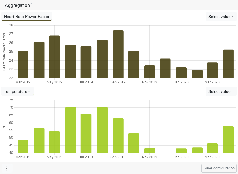
This gives you a diverse overview of your training history and your training behavior.
A few examples of questions that can be answered by an aggregation diagram:
- How many kilometres did I run every month last year?
- How many training sessions did I do last season?
- Am I fitter in summer than in winter?
- Has the balance of ground contact time changed over the year?
- Has my Heart Rate Pace Factor increased in the last 12 weeks?
- Is my performance temperature dependent?
- Is my performance weight dependent?
- Is enjoyment dependent on speed?
01. Introduction
02. Effort
03. Capacity
04. Zones
05. Intensity distribution
06. Zone distribution
07. Form and Fitness
08. Training calendar
09. Activity planning
10. Templates
11. Activity summary
12. Activity attributes
13. Performance
14. Dynamics
15. Series chart
16. Map
17. Segments
18. Elevation distribution and data
19. Capacity indicators and efficiency indicators
20. Power curve and mean maximum values
21. Track times
22. Proprietary data
23. Environment and Weather
24. Race results
25. Custom fields
26. Aggregation chart
27. Relation chart
28. Body data
29. Injuries and Illnesses
30. Equipment
31. Coach
32. Public coach profile
33. Training plans
34. Sell training plans