Series chart
Series chart
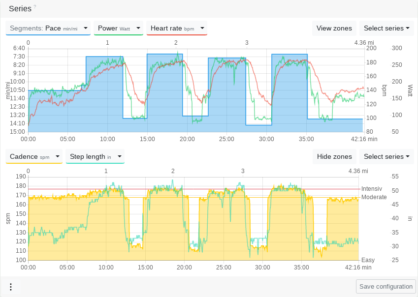
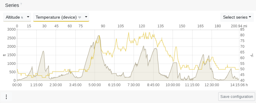
You can use the series chart to analyze the data that is present as a time series in your activity.
You can put up to 5 series on top of each other and synchronize up to 100 additional diagrams.
Modifiers
Primary value
By clicking on the serial type button in the legend, you select the primary value. This has its y-axis on the left side and the series is highlighted.
Segments
In addition to the series data, you can also view the aggregated segments in the diagram.
Zones
If a speed, power, heart rate or cadence series has been selected, the zone boundaries can be displayed by clicking on the "Show Zones" button.
Zoom
You can select a range for a time period in the chart, which shows you the average values and allows you to zoom in.
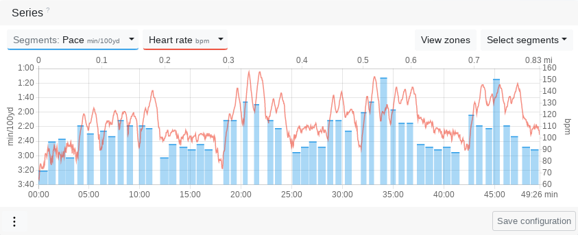
Chart settings
Chart height
The charts can be displayed at normal height or at a decreased height, to make a little more space when you display many activity diagrams or when they are not needed.
Synchronisation
Several diagrams can be either synchronized or decoupled from each other. 'Synchronized' means that the x-axis indicator synchronously follows the mouse position on all charts.
Axis indicator
A Y- and X-axis indicator can be displayed simultaneously or only the X-axis indicator alone.
Breaks
You can display or hide breaks on the activity chart.
Walking phases
For running or miscellaneous activities you can display or hide the walking phases.
Series settings
Lower/upper limit
With the lower and upper limit, you can put a filter on the data series that cuts off the lower and upper value range. This can make sense for very confused series, or to remove measurement errors or outliers.
Simplify
Simplification reduces the number of data points in a time series while at the same time maintaining the informative value, as long as simplification has not been over-applied. Unlike smoothing, simplifying does not add data points. Smoothing would be aesthetically pleasing, but it no longer reflects the true course. We have therefore opted for the more honest option in this case.